|
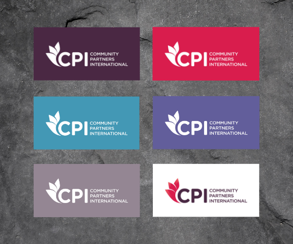
We are delighted to announce the launch of Community Partners International’s new branding, including a new logo and visual identity. We have grown and evolved significantly over the years. We need an updated brand to reflect this evolution and position us for the future. After careful consideration, we chose a new logo with a clean, vibrant and modern look, and with subtle Asian influences. Our new logo incorporates a hybrid wing-and-flower design symbolizing our mission to empower communities in Asia to flourish. The logo colors were chosen to provide a connection to our former logo and embrace our heritage, but with a fresh new direction. The red color symbolizes the vibrancy, diversity and potential of our partner communities in Asia, and the creativity and innovation that define our partnerships. The more measured dark purple color evokes our core values of respectful partnership, community-centered development, and the application of evidence-based approaches to measure and optimize our impact. Over the coming weeks, we will roll out our new logo across our operations. This is a process that will require several steps and so you may continue to see our old logo here and there during this period and beyond.
For our donors and partners, please note that from Wednesday, July 10, 2019 onwards, the new CPI logo should be used in all co-branding instances. Please contact us and we can provide you with the appropriate logo files for your needs, and guidance on usage of the new logo. Here's to a bright future! Comments are closed.
|
AuthorCPI Admin Archives
July 2024
Categories
All
|
|
|
COMMUNITY PARTNERS INTERNATIONAL
580 California St Fl 16, Ste 1658, San Francisco, CA 94104-1068, USA [email protected] +1 510 225 9676 We are a registered nonprofit 501(c)(3) Public Charity. TAX ID 94-3375666 |
©
Community Partners International


 RSS Feed
